|
Tutorial - Emboss Resist and Designer Series Papers by Ann Craig.
This tutorial will show you how using the emboss resist technique on Designer Series Papers is a fun and interesting way of creating gorgeous cards in quick time. The background is already created for you, and the shiny effects from the clear embossing add a touch of class to the finished card. I used the following Stampin' Up! supplies for this card. Designer Series Paper: Spring Break Card stock: Blue Bayou 12 x 12 textured, Soft Sky A4 and Whisper White A4. Stamp Sets: Fabulous flowers, Baroque Motifs. Ink: Craft White, Blue Bayou, Soft Sky and Versa Mark. Accessories: Clear Embossing Powder, Embossing Buddy, Double stitched ribbon- Soft Sky, Bashful Blue Brads, Stamping Sponges. Choose your own papers and stamps, follow the steps in the Tutorial and see what great effects you can achieve.
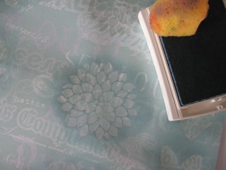
Step 1. Rub the Designer Series Paper with your Embossing Buddy.Load your stamp with Versa mark ink and print directly onto the DS Paper. (You can print a number of images and make multiple cards, but remember to always re-ink the stamp to ensure that there is plenty of Versa Mark on it. Step 2. Sprinkle Clear Embossing Powder over the DS Paper, shake off the excess and use the heat tool to melt the embossing powder. You will see the image appear slightly darker on the page.
Step 3. Load your sponge with colour. (I started with the Soft Sky to get an idea of how this would look). Dab the ink around the embossed area and see how the image starts to "pop". NOTE: I found that the DS Papers tend to absorb the ink more than regular card stock, so the ink needed to be re applied. I also added lots more of the Blue Bayou ink before I was happy with the result.
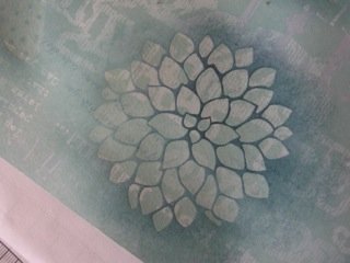
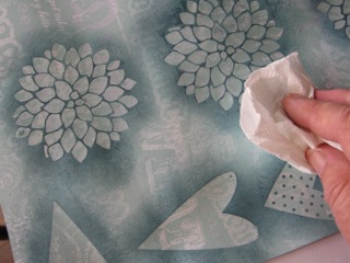
Step 4. When you are satisfied with the amount of ink applied to the Designer Series Paper, buff the embossed image with some paper towel to clean off any excess ink. This will make the image nice and shiny too! You can apply more ink to some areas meaning you can pre determine a lot of the outcome when you use sponging. The other way of applying colour is to use your brayer (roller) and roll over the image. I thought with the design of this card that sponging was better as it leaves more of the beautiful back ground paper visible.
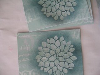
Step 5. Trim your images to suit the card sketch you've decided to use. If you've done multiple prints, you can trim them all differently to produce a number of different cards. You may like to add some more sponging around the outside edges of the DS Paper to soften it for the final product.
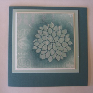
Do a mock up of your proposed card lay out. Screw your eyes up and squint at the balance of colours etc for the card. Choose any accessories you would like to add, but don't add them just for the sake of it, add them to enhance your focal point, ie. the embossed image. And here is the final card. Hope you like it and that you will give this technique a try yourself. I've printed the Baroque motif swirls twice on the base card to bring a little white into the background, and printed the greeting in Craft White too. It may be a better solution to emboss the greeting in white when printing onto a darker background card. If you have any questions about the steps in this tutorial you can 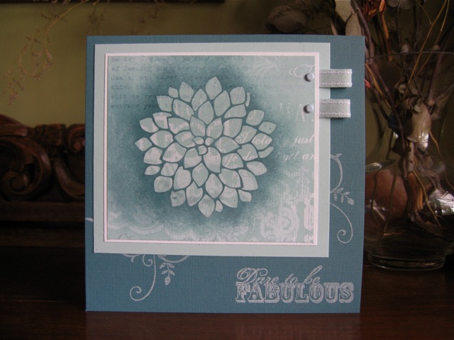
See other examples of Emboss Resist using a brayer.
|