|
What Are Design Principles, And How Will They Effect My Scrapbook Pages?Knowing some basic design principles when you create a scrap page will make the whole process easier and less time consuming. There are a number of elements that need some consideration. We call these elements the Principles of Design.
Often these elements fall into place without you really being aware of what you are doing. Some call it "natural talent", that is you just know what looks right for the effect you are wanting to create. Many of us use these design principles without being fully aware of them. Even so, when you start out it really helps to have a checklist of elements, and a little knowledge of how they will effect your projects.
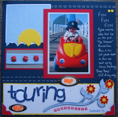
Most often, "pictures" of pages form in our head - We get visual ideas. However there are plenty of occasions where the use of a Design Principles checklist will assist when something doesn't look "quite right". It helps to view the design with a different pair of eyes, and often leads to identifying that missing something. Of course, you can always put that less than satisfactory project away for a while, stew over it a little and spend a lot of time wondering what to do. If you have a checklist, it can quickly be utilized to identify that missing element. You'll be surprised if you place a mental tick against things like colour distribution, positive/negative shape areas, balance of shapes, contrast of shapes, patterns and textures etc., just how quickly your page will evolve. When you combine basic knowledge of Design Principles with colour knowledge, creating interesting and varied page layouts will become much easier. Here is a list of the basic Design Elements See on how you can use these elements in your craft projects. Our first Element is LINE. Read the information provided in this article. You may find of particular interest, the ability of different lines to help create a variety of "moods". It's a worthwhile exercise at this point, to evaluate one of your already completed scrap pages. Have you used different line types in the layout? Do they help to create a mood? Was this done on purpose? By that I mean, did you know that horizontal lines help create a calm, tranquil impression? Curved lines create a sense of flow. What lines do you use most often in your designs? Does this help you determine your style? Perhaps you love the Vintage look, you may have a "Classic" approach or you may be "Contemporary", creating dynamic, clear cut layouts. 
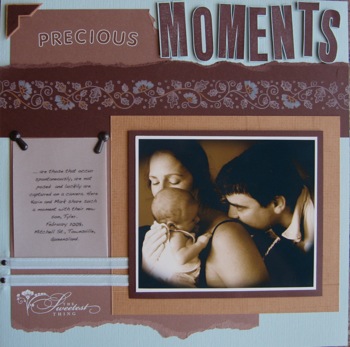
The strength of lines can be manipulated by thickness, colour, continuity and direction. For example a meandering line will have less strength and therefore impact, than a one centimeter thick straight line. Hence, lines used for "doodling" have less strength and act as a support to the stronger shapes in this page layout. These lines become decorative, sit in the background, but still play an integral part in the overall design of the page. We all know what SHAPES are, but did you know that shapes can be positive like a solid circle sitting in a square (the circle is the positive shape) or negative - the shape formed between the edge of the circle and the outline of the box. This can also be defined as the BACKGROUND space. Many crafts people and artists don't recognize the importance of Negative space. It helps define a subject, and brings balance to a composition. Discover the power of negative shape in your designs. What is it, and how can you use this concept to improve your artistic layouts? Follow the link for information about positive and negative shape, giving you easy to follow advice and examples of using negative spaces. TEXTURE is a wonderful addition to any craft project. It can be visual or physical. Read a detailed explanation of using
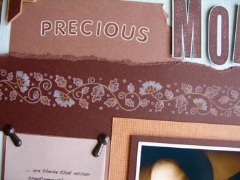
Visual texture is an impression of texture. One easy way it can be created is by using large Textured Background Stamps such as "Sanded" or "Canvas" by
Stampin Up.
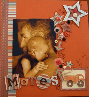
These stamps have the advantage of allowing you the luxury of choosing exactly which colour you want on your texture, as you just apply ink to the stamp and position it wherever you choose. Stampin Around Wheels also give you great textural options and have the advantage of different sizes. Visual texture is also a great method of conserving on the thickness of you scrapbook - it looks 3-D but in fact is flat. Apart from stamping, visual texture can be obtained by various colouring techniques that give the impression of depth or texture. Physical Texture is tactile. You can actually feel the changes in the surface of your page. This can be achieved by simply building up a surface - add foam dimensional tape or buttons to an element from the page and raise it. Other ways of achieving physical texture on your scrap pages are: Chip board shapes and letters, ribbons, braids and lace metal embellishments and 3-D stickers or hand made 3-D embellishments. Crimping the card stock or texturing the paper in a machine such as the Big Shot, with a pre designed texture plate, is another method where you can achieve exciting results. COLOUR is an integral part of each scrap page we design, and is therefor a major Design Principle. Whether we choose to limit the range of colours, pick out a couple of colour highlights from our photos, or go monochromatic, some basic information about the effects colour choices have on others is worthwhile knowledge.

Follow the Colour link
For further information relating to to the Design Principles of SIZE, DIRECTION, VALUE- read these interesting articles.
|


