|
The colour combinations you use make a world of difference to your craft projects.
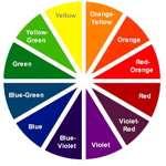
An understanding of colour combinations and how they interact is really helpful when crafting. This enables you to get the maximum effect you want in your paper crafts and stamped projects. Have a look at this basic Colour Wheel containing Primary, Secondary and a few Tertiary colours.
Scrunch up your eyes and squint at the wheel. This will blend the colours a little. Can you see that approximately one half makes you feel warm? These are collectively known as the Warm colours. What about the other half? - they are generally known as the Cool colours. You might like to relate these feelings of warmth and coolness to your projects. Many colours and colour combinations have been assigned generally accepted meanings or feelings. Explore these colour combinations and compare your own reactions and feelings.
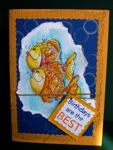
Carefully chosen colours really add to the overall design. Primaries - Red, Yellow and Blue, are wonderful to use on cards, gifts or art work for children. They are strong and pure and when you add the variety of the Secondaries - Orange, Purple and Green you have a lovely palette to create vibrant work. Look at this Birthday Greeting Card, made for a young boy. See how the use of yellow and blue (Primary, and very close to Complimentary colours) creates a happy, bright card that instantly grabs your attention. You will find these colour combinations attract people from a distance. They call out to passers by "to come and have a look". Great if you are making items for craft stalls or your child's school fete. You might like to create some real power by using Complimentary colours in your design. They are found opposite each other on the colour wheel. Learn
more about compliments and how they react.
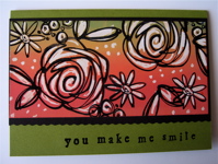
Another very popular concept is to choose Harmonious Colours for your project. You will find these beside each other on the wheel. Can you see that this range of Harmonious colours almost turns into compliments at the base of the card? See how the contrast is so much stronger for Complimentaries than it is for Harmonies Stamping and ink companies produce a variety of mixed colours as well as the basics. You'll find many choices, but some companies, like Stampin' Up!® make it easier by marketing their colour range in "families". These are colours that work in various combinations, and are suited to personal style preferences.. Have a look at the Stampin' Up!® Catalogue Find the colour pages (pp 130 - 131), then see if you can distinguish the various categories we have discussed. The grouping into families is quite helpful when you are starting out, feeling a little unsure, and looking for some guidance. However you shouldn't be restricted by this concept as often you will find brilliant combinations by using 2, 3 or 4 colours from different families. As always in craft, the decision is individual and quite personal. Whatever pleases you the most is the right choice! Now we are aware of all the basic concepts for colour, let's move onto Colouring Techniques Have a look at the pages titled Colouring With Blender Pens Pastels and Versa Mark Masking and Sponging Kissing Black Magic. You'll find other methods of adding colour to your stamped images throughout the site, so enjoy browsing. View my card gallery for ideas on how to use different colouring techniques
|