|
Complimentary Colours Schemes Create Brilliant Contrast and Instant Attraction to Your Artwork.
The concept of using Complimentary colours is particularly suitable for use in basic graphic designs incorporating strong, simple shapes. 
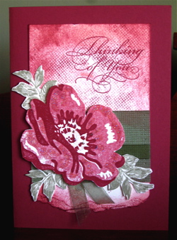
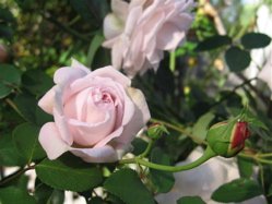
Use it on gifts and cards for children - the brightness of these colour schemes is instantly attractive to the young, and the young at heart!. In this blue and yellow card, I used the Stampin' Write Markers to colour the images from the "All In The Family" stamp set. The card is based on the Triangle composition, with the "Birthdays are the Best" sign forming the tip of the triangle. Notice how the composition is symmetrical. All images © Stampin' Up!. Artwork by Ann Craig A very simple explanation is that any given colour brings out the most depth of colour in its compliment. ie. the Red will look its "reddest" when it is placed beside the Green, which in turn will look its "greenest." See the compliments in various hues of the pink rose against the green foliage. These colours are natural together, and yet the pink against the green really defines the shapes and linear quallities of the composition. Photo by Ann Craig This theory can be transferred to pastel colours like pink and pale green, light blue and "apricot". These softer colours are created by adding white to primary, secondary or tertiary colours and are often referred to as Tints of a colour. There is no need to always make projects that take hours, when using this principle will have you producing many striking cards in a short time. Try this exercise... Cut out 4 x 1cm squares of YoYo Yellow and a 3 cm square of Basic Black, Whisper White, Only Orange and Lovely Lilac. Place a Yellow square on the centre of each of the larger coloured squares and compare how they react with each other . You will certainly get a good contrast, and the yellow shape will even appear slightly bigger placed against the black than it does when placed against any of the other squares. Black is always fabulous against White, but in the case of Yellow you will get a vibrant contrast and more strength in your colour by placing it next to Purple or Bright Blue. Experiment with all the complimentary colours and their variations to find solutions that you enjoy and are comfortable using. Try using shades and tints of the complimentary colours - see what happens. You may still prefer to use your colour next to a black but I would urge you to at least try the other combinations. You will see a vitality in your work that perhaps had been missing previously. To have a look at some examples and see how the colours appear slightly different depending on where they are placed, go to
this other informative colour site
and click on the design and art button. This site gives easy to understand information and some great examples of colour reactions. You will find it very interesting if you have never formally learnt about colour. Continue discovering how you can use basic colour theories to enhance your craft work. Go from
Complimentary Colours back to Colour Combinations
and you will find more pages and ideas. I encourage you to explore colour. Set yourself some colour challenges or participate in my monthly colour challenge, so that you extend and develop your creative options.
Enjoy the experience!
|
 I often look to Nature for ideas as I find it is a great source of colour inspiration.